On this page
The frame looks wrong, and you can’t quite place why. The subject is there. The light is fine. You shoot anyway and move on.
Most of the time, it’s not a settings problem. It’s not even a subject problem. It’s weight — the way different parts of the frame compete for the viewer’s eye, and the fact that something in the scene was winning that competition when your subject should have been.
Visual weight is what determines where the eye lands first, where it travels next, and whether it ever finds what you actually wanted to show. Photographers learn the concept quickly. Using it at the camera — while the scene is changing, the light is shifting, and there are three distracting things in the background — is a different skill.
That’s what this covers. Not the theory. The decisions.
Start With the Question Every Composition Needs
Before you compose anything, scan the frame and ask one question: where does my eye go first? Not where you want it to go. Where it actually goes.
Hold the camera up. Don’t compose yet. Just look. Where does your eye land?
It might be a bright window sitting behind your subject. A patch of saturated color on the left side of the frame. A sharp edge cutting through an otherwise soft background. A person walking through the edge of the scene. Whatever it is — that element is already carrying the most visual weight in this composition, regardless of whether it’s your intended subject.
The first practical move in any composition is identifying the heaviest element. Everything after that is a decision about whether it belongs where it is, and what to do if it doesn’t.
This sounds obvious. It isn’t — because most photographers look at what they want to photograph, not at what else is happening in the frame. Training yourself to scan for the heaviest element first changes how quickly compositions come together.
Move Before You Adjust Settings
When a frame isn’t working, the instinct is usually to change something about the camera. Different focal length. Wider aperture. Longer shutter. But most visual weight problems aren’t camera problems — they’re position problems.
The distracting background element is there because of where you’re standing, not because of what you’re shooting with.
Take three steps to the left. Crouch down. Get closer to the subject. Each of those changes the relationship between elements in the frame — what’s heavier, what recedes, what the background becomes. A wall that was busy and competing at eye level might simplify completely from a lower angle. A cluttered background might drop away entirely when you move slightly right.
This is the cheapest fix in photography and the most frequently skipped. Photographers adjust settings before they adjust position. It should be the reverse.
Moving also teaches you the scene. When you walk around a subject before shooting, you understand the weight relationships from multiple perspectives. You see which position gives you a clean separation between subject and background. You notice where the light falls differently. You find the angle where the frame actually works.
Move first. Adjust settings second.
Use Depth of Field as a Weight Tool, Not Just a Stylistic Choice
A wide aperture does one thing most people don’t think about: it takes weight away from the background. Not just sharpness — actual visual pull. A background that was fighting your subject for attention starts to lose that fight.
So before you go wide, ask yourself one thing: does this background need to be seen, or does it just need to get out of the way?
For an environmental portrait, that background is doing a job. It’s showing you where this person lives, works, or exists. Kill the depth of field completely, and you’ve removed the context that made the portrait worth taking in the first place. The background should recede — not disappear.
Street photography is a different situation entirely. The background is usually chaos — people, signs, parked cars, whatever the city threw behind your subject. It has nothing to add. Go ahead and reduce its weight.
Same aperture adjustment, two completely different reasons for making it.
Neither approach is universally right. The question is always what the image needs.
Place Your Heaviest Element With Intent
Once you’ve identified the heaviest element in the frame — your subject, a shaft of light, a person’s face, a strong color — decide where it sits. Put the subject dead center, and the frame stops moving. The eye lands, stays, and doesn’t go looking for anything else. That kind of stillness works — for a reflection on water, a doorway, a face shot straight-on. The composition feels intentional, not accidental.
Off-center placement creates tension. The heavier element on one side of the frame leaves the other side lighter, and that imbalance makes the eye move — which creates energy. This is the real reason the rules of composition in photography, like the rule of thirds, work in practice: they don’t just position the subject off-center; they create a weight relationship between the subject and the empty space beside it. The eye goes to the subject and then has somewhere to travel.
Most photographers learn off-center placement and apply it to everything. That’s where it stops working. A heavy subject pushed to the left with nothing on the right doesn’t create tension — it just looks like the frame wasn’t thought through.
The question isn’t where to place the subject. It’s whether that placement is making the image better, or just ticking a composition rule.
Balance With a Secondary Element — or Don’t
When a subject sits off-center, the lighter side of the frame needs attention. Not necessarily another subject — even a tonal difference, a texture change, or a small figure in the distance can provide enough weight to stop the frame from feeling like it’s tipping.
But the mistake is filling that space by reflex.
Sometimes the empty side should stay empty. Negative space carries its own visual weight — less than a sharp subject, but enough that a frame with a strong element on one side and clean space on the other can feel complete rather than unfinished. This is especially true in portraiture and documentary work, where negative space beside the subject can emphasize isolation, stillness, or contemplation. The emptiness isn’t a problem to solve. It’s information.
The practical test: look at the lighter side of the frame and ask whether it feels intentionally open or accidentally incomplete. If there’s a tension that the image seems to be ignoring, something needs to be there. If the emptiness feels like it’s saying something — like it’s part of the image rather than a gap in it — leave it.
This is one of those distinctions that’s hard to learn from description and easier to learn from looking at a lot of photographs. Pay attention to negative space in images you admire and notice what it’s doing.
Watch Color the Way You Watch Light
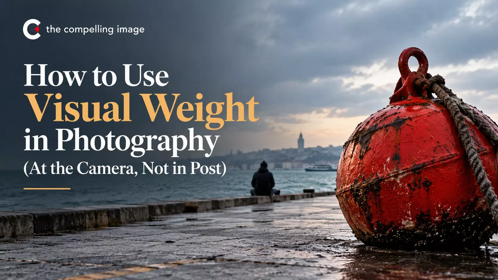
A single saturated warm color in a frame of cool muted tones will pull the eye before almost anything else does. It doesn’t matter how small it is.
This is predictable enough to use deliberately — and frequent enough to be caught by when you’re not paying attention. A red sign in the background. An orange jacket on a bystander who walked through the scene. A bright blue door that’s only partially in frame on the right edge.
Size doesn’t matter here. Saturation wins. The eye doesn’t follow your intended hierarchy. It goes straight to the loudest color in the frame.
Before finalizing a composition, actively scan for color weight. Check the corners. Check the edges — partial elements at the frame’s edge often carry more visual weight than they deserve because the eye notices the cut-off and gets pulled there. Check whether any background color is warmer, more saturated, or more contrasting than the subject.
You have three options when you find a competing color: exclude it by changing position, include it deliberately by making it part of the composition, or reduce its weight by putting it further out of focus. Ignoring it and hoping it won’t matter in post is not a real option — it will matter.
Tonal Weight and How Light Shapes the Frame
Bright areas pull the eye. It doesn’t matter whether the subject is larger or more central — if the background is brighter, it wins.
If your subject is in shadow and the brightest element in the frame is the sky, a patch of reflected light on a wall, or a lit window in the background — the subject is losing the weight competition. The brightest thing gets the attention, whether you intended it to or not.
How you expose a shot is a composition decision, not just a technical one. Expose for the subject and the background falls back. Expose for the background and your subject goes flat — and loses the weight battle.
The same thing happens in post. When you pull down the background in editing, you’re not just adjusting brightness. You’re telling the eye where to go.
In low-light and interior photography,this becomes especially direct. The photographer who understands tonal weight doesn’t just expose correctly — they position the subject in relation to light sources so that the tonal hierarchy supports the composition. The subject is where the light is. The frame gets darker as you move away from the subject. The eye has no choice but to land where you want it.
Size and Isolation
Larger objects carry more weight than smaller ones — but context changes everything. A small subject in an otherwise empty frame can carry more weight than a large object in a busy one. Isolation amplifies weight.
A lone figure on an empty street carries more visual weight than five people in a crowded market, even though there are fewer of them. The eye gravitates toward the thing that’s different from its surroundings — the single point of focus in an open space.
This is useful for landscape photography, where a single element (a tree, a rock, a person for scale) can anchor an otherwise abstract composition by becoming the heaviest element in a frame full of tone and texture. It’s also useful for understanding why some images feel scattered: they contain multiple isolated elements of similar size, and the eye doesn’t know which one is the subject.
How to Know If the Composition Is Working
When the weight is working, you don’t notice it. The eye just moves — lands on the subject, travels naturally, doesn’t get stuck anywhere it shouldn’t. That’s the only test that matters.
When you review your shots, track where your eye actually goes when you look at the image. If it goes where you intended, the composition is working. If it keeps getting pulled somewhere else, something in that area has more weight than you realized when you were shooting.
That discovery is useful. It tells you exactly what to fix next time: a background element you need to exclude, a color you need to manage, a position shift that would have changed everything.
Bringing It Together: A Shooting Sequence
When you approach a new scene, the visual weight sequence looks something like this:
Before the camera comes up: scan the scene and find the heaviest element. Brightest area, most saturated color, sharpest edge. Is that your subject — or something competing with it?
Then move. Two or three positions before you even raise the camera. Watch how the background shifts. See where the distracting elements fall out of frame or drop behind the subject.
Now raise the camera. Check the corners and edges — anything pulling the eye away from where you want it? Is the subject the brightest thing in the frame?
Decide on placement. Does this image need to feel settled or tense? If the subject is off-center, is the lighter side doing something, or just sitting empty by accident?
Shoot — then check the frame immediately. Not to see if you got the shot. To see where your eye actually went. That’s the adjustment for next time.
None of this takes long. A few seconds per step. But these are the decisions that happen at the camera — and they can’t be made anywhere else.
Applying This Beyond Composition Basics
Visual weight isn’t a separate concept from other composition ideas — it’s the mechanism behind most of them. The reason the rule of thirds works is weight and balance. The reason leading lines work is that they direct eye movement — which is weight in motion. The reason negative space works is that it creates contrast between weight and emptiness.
Once visual weight makes sense, the rules of composition in photography stop feeling like rules. The rule of thirds isn’t a formula — it’s a weight decision. You’re not placing the subject off-center because a guideline says to. You’re placing it there because that position creates a relationship with the rest of the frame that the image needs.
This is a useful shift in how to think about composition — from following guidelines to understanding what the guidelines are actually doing. For photographers who want to work through this kind of thinking in a structured way, with specific projects and a framework for reviewing what’s working and why, The Artist’s Lens is built around exactly that approach.